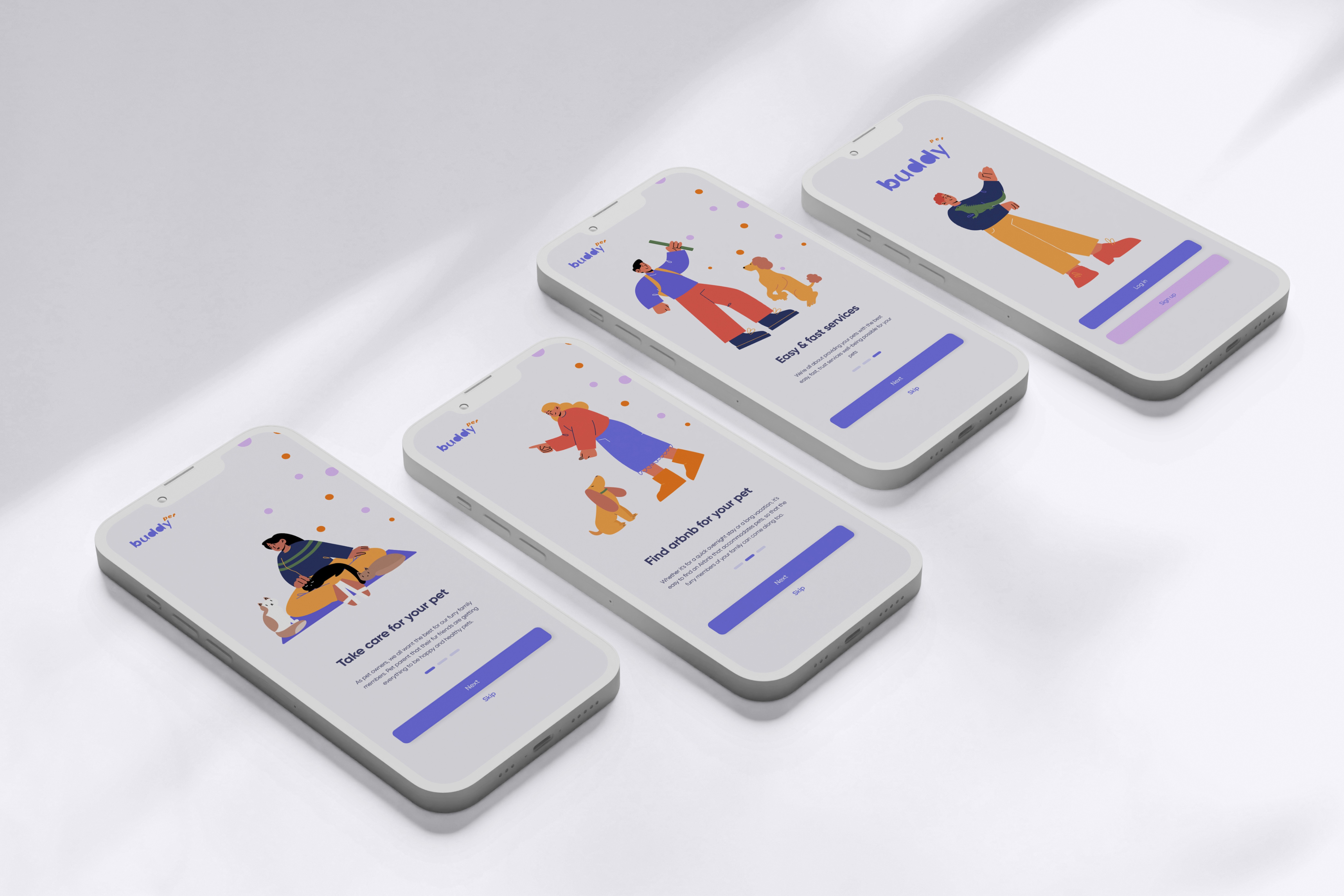
2022
Buddy App
Case Study for Mobile app
About the product
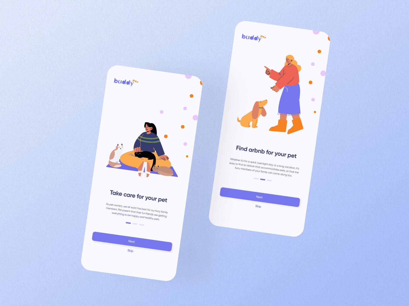
Buddy Pet is the complete pet services where the user can easily take care of their pets
Team
2 team members, Firuza Aliyeva., Gulchin Osmanova
Project Timeline
4 weeks
Discovery
Overview
Buddy Pet is the complete pet services where the user can easily take care of their pets. It provides professional pet services which are pet sitting, take care, airbnb for your pet, pet walking, Vet med, educate your pet. Users can find right various pet services in one platform.The challenge was to conduct a research and come up the concept that fits the newest trends and costumers' needs. It required UX creativity, when it comes to information structure on the same level as UI skills in order to produce something that stands out.
Problem statement
In the contemporary world, the management of time and the delicate balance between work life and personal life have become increasingly challenging for individuals due to demanding work schedules. This challenge extends to the care and well-being of their beloved pets. Many people are finding it difficult to ensure that their pets receive the essential care and attention they require, precisely when needed. The lack of accessible and reliable pet care services has created a significant gap in meeting the needs of pet owners and their furry companions.
User Research
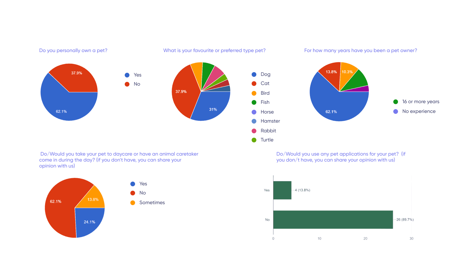
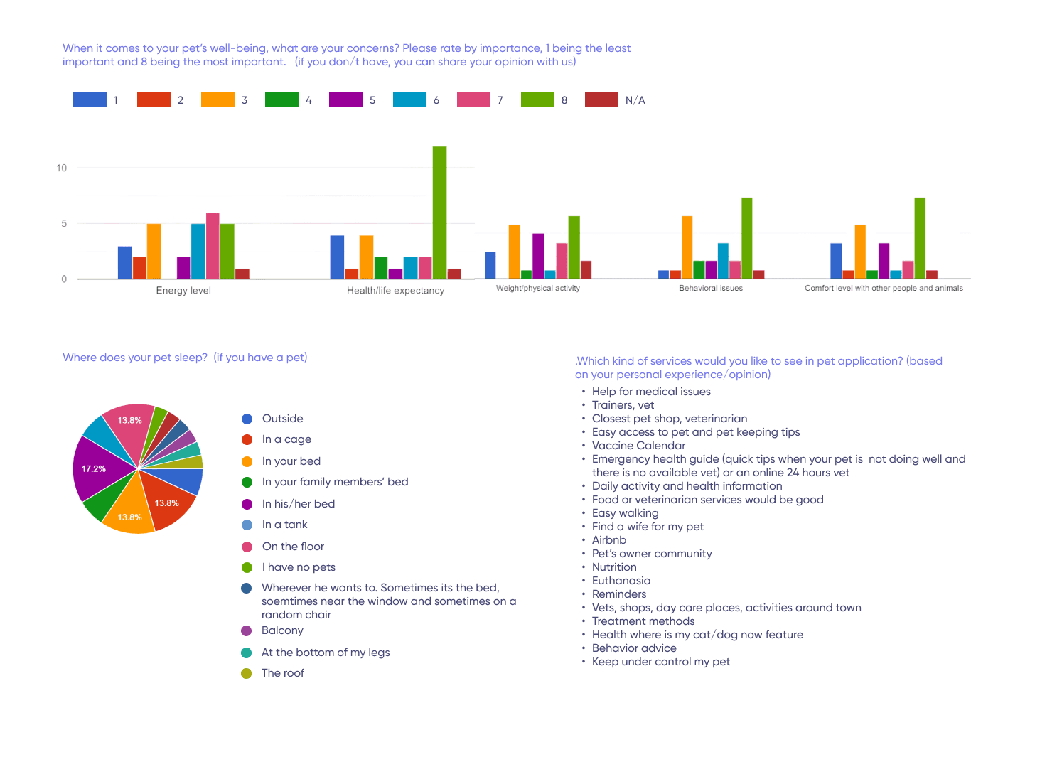
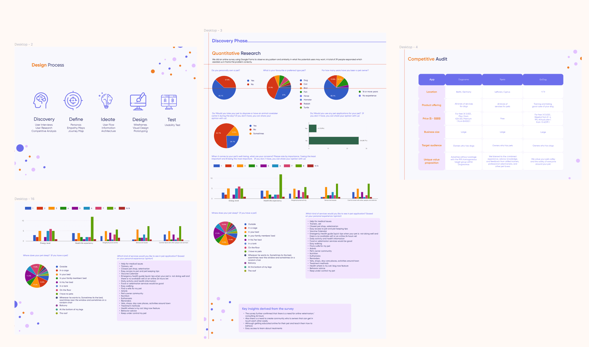
As part of our project, we conducted user research to gain valuable insights into the needs and preferences of potential users. We utilized an online survey created using Google Forms to gather information. The survey received responses from a total of 29 individuals, providing us with valuable data. This research played a crucial role in helping us accurately frame the problem we aimed to address. By observing patterns and similarities in the responses, we were able to better understand the user requirements and align our project goals with the users' expectations.
Goals and objectives
Goals are centralised pet care platform, time management and convenience, quality pet care services, education and consultation, also user engagement and satisfaction, through the mobile app is able to be pay seamless and review.
Aggregate a diverse range of pet services, including sitting, walking, veterinary care, and education.
Enable one-click payments for seamless transactions, enhancing user convenience.
Partner with reputable pet care providers to maintain service excellence.
Introduce consultation services, connecting users with pet experts for personalized advice.
Implement loyalty programs or incentives to enhance user retention and satisfaction.
Develop a user-friendly review system to gather insights and enhance service quality.
Problem definition
Competitive analysis
Thoroughly studying competitors shaped a robust foundation for our app design, identifying strengths, weaknesses, opportunities, and threats.
User Personas: Crafting precise user personas guided our iterative design, ensuring alignment with user needs and preferences.
Trustworthy Pet Care:
Challenge: Users sought reliable pet care through the app.
Solution: We curated a network of trustworthy providers, prioritizing user peace of mind.
User Flow Enhancement:
Challenge: Users desired a seamless mobile experience for monitoring.
Solution: Our design focus improved mobile usability, aligning with users' daily lives.
This case study showcases our commitment to user-centric design, resulting in Buddy Pet Services delivering trust and a user-friendly experience
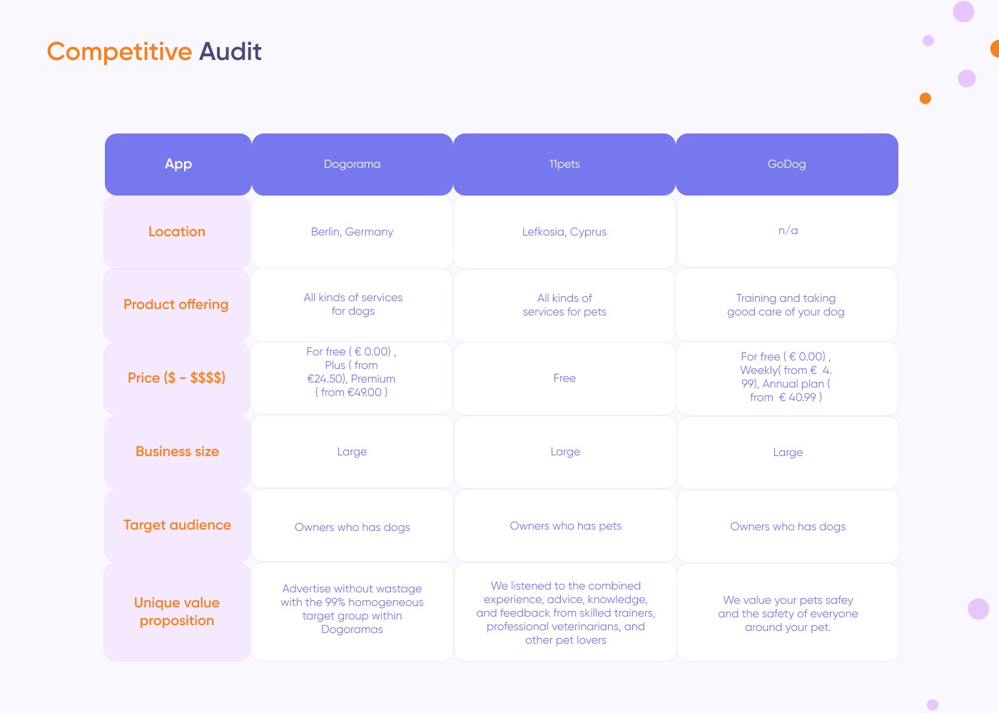
We helped to shape the moderation guide, led interviews and analysed the results.
Scoping
Trustworthy Pet Care:
Scope Focus: Establishing trust through curated pet care providers.
Outcome: Users now find reliable and trustworthy caretakers for their pets on the app.
User Flow Enhancement:
Scope Focus: Improving mobile usability for seamless pet monitoring.
Outcome: Our design enhancements provide users with an intuitive and effortless mobile experience, meeting their daily life needs.
Solution design
Design
This one-stop solution offers a range of essential pet care services, including expert consultations and educational resources. Users can easily book services, make app payments, and read and write reviews on services. With Buddy Pet, pet owners can ensure their furry companions receive the care, attention, and education they deserve, all in one convenient app.
The main goal is developing interactive prototypes and focusing on enhancing user engagement, feedbacks and delight through intuitive
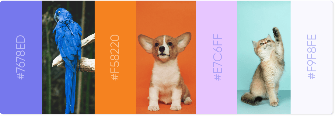
As a app, it is important to deliver a right message to users. A calm and trustworthy shade of blue adds a sense of trust. Colors we used are representing a calm and trustworhty, shade of blue adds a sense of trust, vibrant oranges injects energy and highlights essential elements, soft lavender contributes to a serene and harmonious visual experience.
Clean and light gray creates a subtle background, enhancing readability.
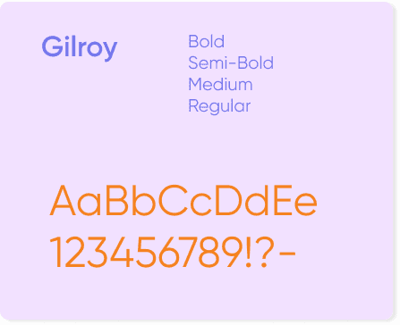
The Gilroy font, known for its simplicity and modernity, complements the clean design by providing a polished and easy-to-read text.
This thoughtful color palette and font choice create a harmonious and aesthetically pleasing user interface that is both visually appealing and user-friendly. The clean and minimalist design approach ensures a smooth and enjoyable user experience.
The prototype we tested was based on the existing UI components.
Visual style
Execution
Mobile design wireframes
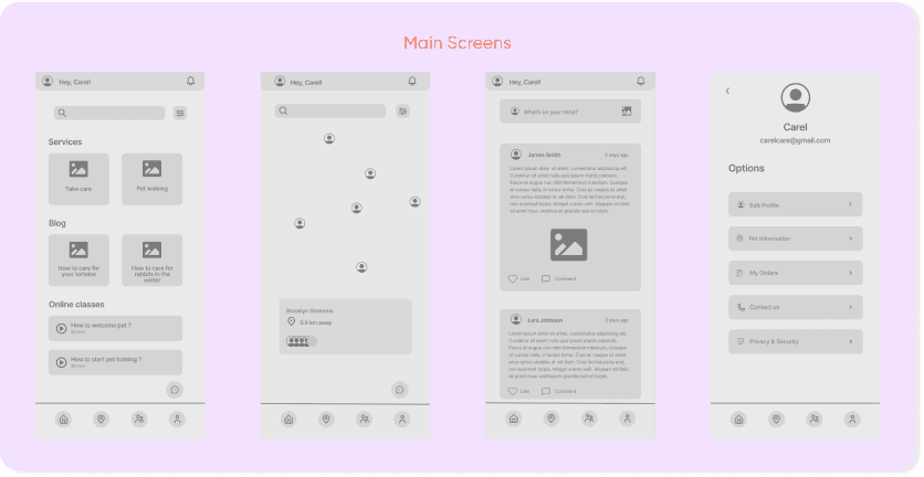
In the initial stages of our design process, we crafted Low Fidelity Wireframes through a combination of paper sketches and FigJam, allowing for quick ideation and collaboration. Subsequently, aligning with guidelines, we meticulously refined and corrected these low fidelity sketches. Transitioning to the next phase, we elevated our design by creating High Fidelity Wireframes using Figma. This shift allowed us to bring precision and a polished aesthetic to our user interface, ensuring a seamless and visually appealing representation of our design concepts. The combination of iterative low fidelity exploration and the precision of high fidelity wireframing in Figma forms a dynamic approach that captures both creativity and adherence to design standards.
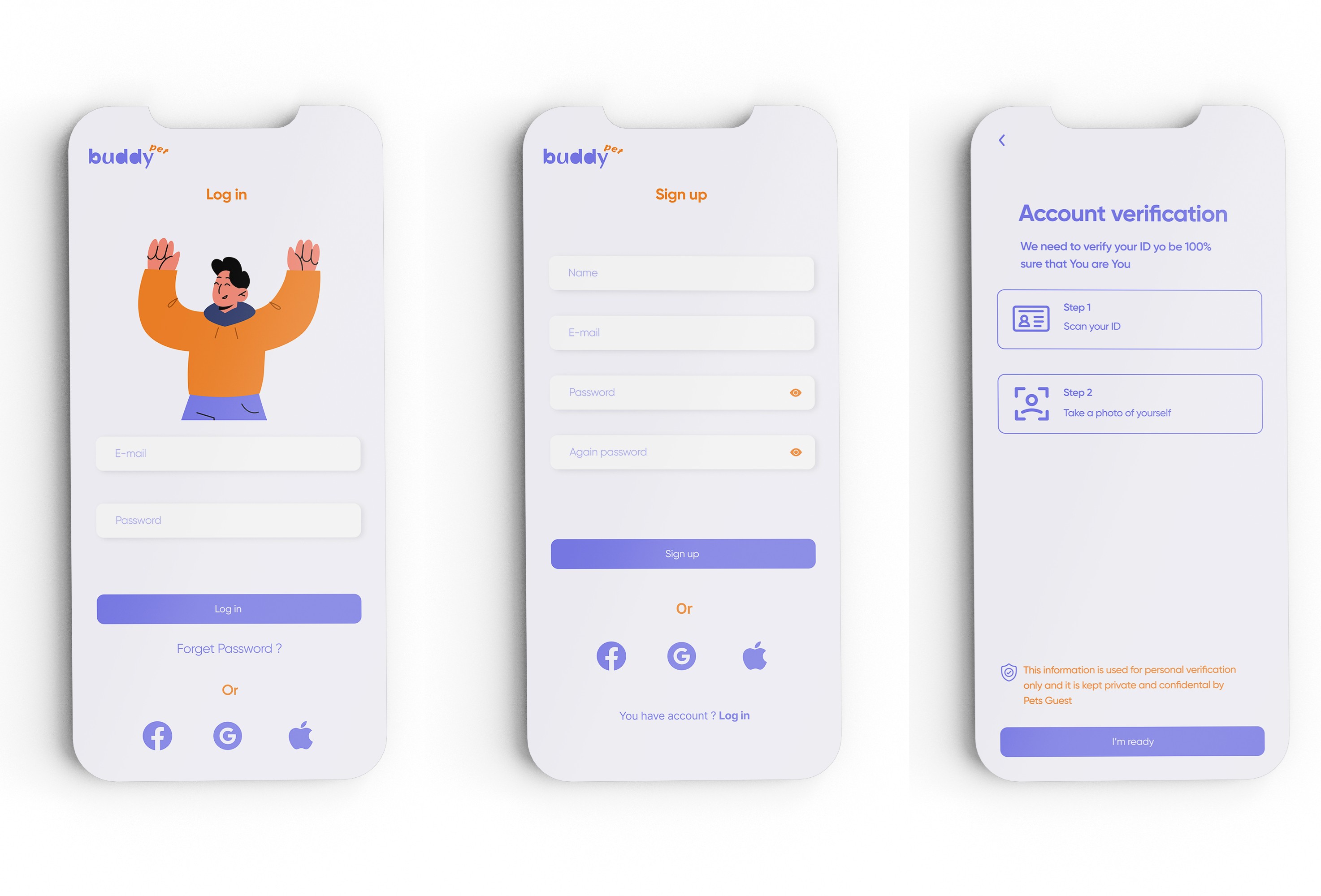
We defined HI-Fi wireframes for our Buddy app.
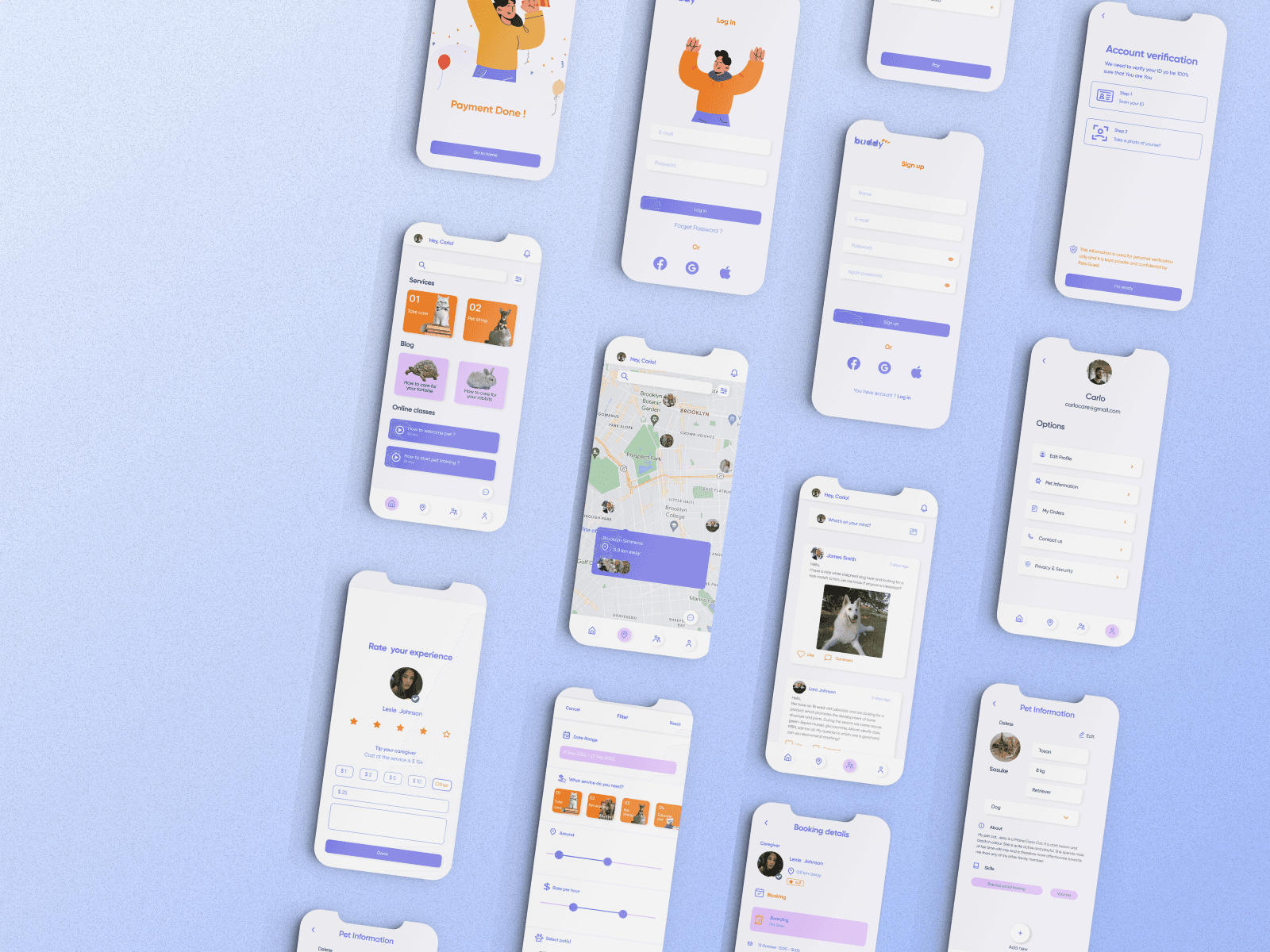
Final designs
In the culmination of our design journey, we endeavored to craft a visually appealing user interface by meticulously refining each element and screen. The final design reflects a harmonious blend of aesthetics and functionality, ensuring a captivating and user-friendly experience.
